Work / Snap By Groupon
Snap Saves was a company purchased by Groupon in 2015. The concept is pretty straightforward:
1. Look at available offers.
2. Go to the store and buy them.
3. Take a photo of your receipt.
4. Get cash back.
It is the paperless coupon model that many companies and retailers have been chasing for the past few years.
Snap Saves was an app bootstrapped by devs and devoid of a dedicated designer. The core technology worked but it desperately needed some design love. I spent several months working with the team on a plan and design system to re-launch the app on iOS, Android and web.
Below is case study examing that process in detail. The front end of the case study is more technical, explaining some of the problems being adddressed and also why we landed on these solutions. The latter portion of the case study surfaces a larger collection of the final visuals (design system, ui, illlustrations).
Outcome
The intended outcome of this exercise was to identify areas in the app that could be streamlined, removing some of the technical debt and improving the overall usability of the app.
Structure
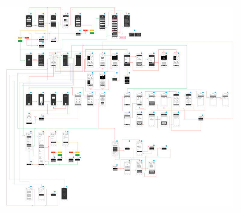
To get a better understanding of the current app, we had to account for all of the screens. When Snap Saves was acquired, there were not things like end-to-end flows or navigation trees. There was no full time designer and the company itself was a pretty scrappy startup. Each time a new feature or screen was added, the stack tended to grow unattended.
In the early stage startup world, it can sometimes be tough to fight for more thorough design processes (or just not even have the resources for them), so we needed to establish a baseline from which we could work.
To do so, a screen audit of the existing app gave us a better idea of what we needed to address.
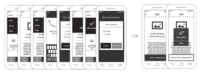
One of the things that really stood out was the sheer number of screens dedicated to the shopping list feature, something a minority of users (22%) actively managed. Out of the 61 core screens in the audit, 22 were in some way associated with the shopping list (36%). The number was even more staggering when you looked at logged in screens (43%). Nearly half the app was dedicated to a feature that less than a quarter of the users even bothered with. A cross section of these are depicted below.

These screens included everything from adding an item from multiple views (deal list and deal detail) as well as a fairly complicated sequence of screens that allowed you to manage / create multiple shopping lists. Some of you are probably thinking, “well 25% of users are engaging with this feature!”…which I was too, until I asked “how many people have multiple shopping lists?”. The answer: less than 3%.
I think it is a good lesson in not only asking questions about the bigger picture of a feature but also its’ individual parts. There was a ton of resistance on scaling back the shopping list and with good reason. The prospect of altering something 25% of your users engage with is scary but digging one layer deeper and finding some UX bloat allowed us to greatly reduce the complexity of shopping lists.
The result was not only reducing 8 screens down to 2 but also simplifying the feature and making it easier to use (shown below). The user now only adds those items to their shopping in the most logical step of the offer flow. That is done on the details page (after a user has had a chance to assess any restrictions), with one tap and slots the item / offer in to a single shopping list.
Removing a lot of this functionality from the existing shopping list flow also allowed us to re-evaluate how the system worked with only a single list. Adding things became easier because the user didn’t have to think about which list it was going to and it also allowed us to refine the ways users interacted with the list itself.
The previous system asked users to add an item or add an offer, which we found out, was confusing to the users. Most couldn’t parse the difference between the two and it created unnecessary friction. It was simplified to a single action “add an item to this list” and made it a free flowing. If you added something that we had an offer for, we would automatically alert you, so the process of surfacing offers was more seamless. This was also great in the use case where someone made a grocery list ahead of a shopping trip. At the time they added “Milk” to their list, we may not have had an offer for them but if a newly posted offer matched something on your list, we could alert the user so they could realize some additional savings.

Another major pain point for the users was the onboarding process. A user really had no insight in to exactly what it was that we offered (see below). They were treated with a login / signup screen that immediately asked for information and didn’t supply any sort of value prop to the user.
Onboarding is notoriously terrible from an engagement standpoint. According to a 2015 eMarketer study, as many as 25% of app users open an app once and never return. Those numbers get even worse when you limit app functionality for logged out users and catastrophic when you not only limit app functionality but do nothing to explain why a user would even want to enter information to get past the gate.
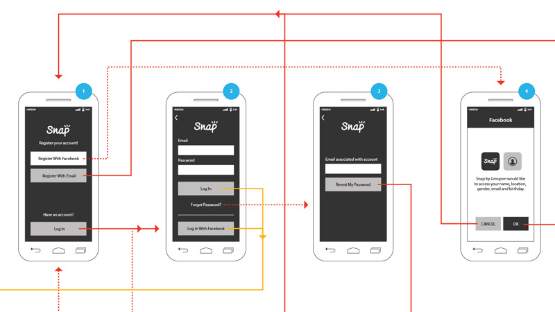
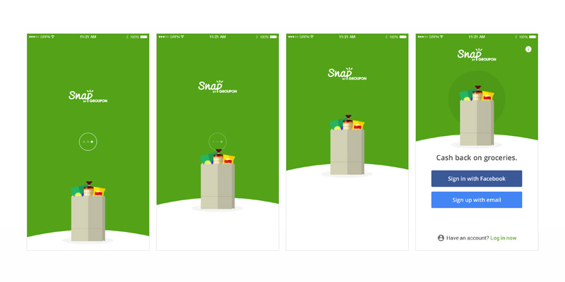
To improve the onboarding process, we made a few changes to how we presented the brand. The hero image was more clearly defined and showed a full bag of groceries.
Below that image, we included a tag line that very directly stated the essence of the app: “Cash back on groceries.” In one image and 4 words, a new user can quickly understand what the app does.
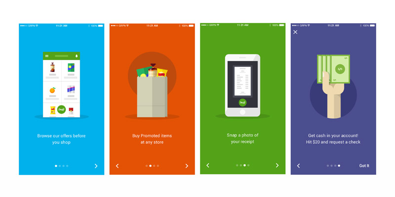
If the user still wasn’t convinced that this was for them, we surfaced a tutorial that explained in a little more detail how the app worked. This helped reinforce how easy it was to not only use but to save money. These changes decreased the bounce rate by 18%.

An additional piece of the app that was lacking more obvious educational guidance was the receipt funnel. Once a user entered this portion of the app, we really wanted to do all we could to facilitate them sending a receipt. Not just sending a receipt but one that would be accepted.
We received the most customer service complaints and lost the most users through things like denying credit for an item a user actually bought. That most commonly happened two ways:
1. The user didn’t submit the entire receipt
2. It was either blurry or could not be read by someone reviewing it (a lot of times because of the distance the person was taking the image from). We knew the reasons for coupon rejection but weren’t doing a good job instructing the user on how to avoid them.
To help alleviate that disconnect, we introduced a short animated flow that was shown during first time use. The short two screen intro informed the user to snap clear readable photos (aligned to the frame edges) and also that they could tap the “+” button to add any remaining portions of their receipt. Once a user dismissed the intro flow, we allowed them to re-open it at any time via a “tips” link next to the camera icon. These changes decreased the CS call rate on false negatives by 7%.

Interaction / Visual Design
After addressing some of the larger usability issues with the app, the focus turned to the interaction and pure visual design.
On the to-do list was to overhaul the brand so that it more closely aligned with Groupon. That included style and interface guidelines that blended nicely with the new direction Groupon was trying to head in, as well as injecting personality to differentiate it in the market from some of our competitors.
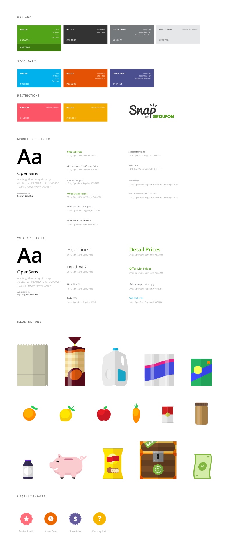
The more playful visual style helped get away from a lot of the stock photography the app relied on and gave it a lot more personality.
As this initial illustration style evolved, it also produced some really fun, quirky characters that were injected throughout the experience. Who doesn’t want to celebrate saving some money with a cyclops carrot?

We went in knowing you can overdo illustration, especially when trying to produce a more mature looking app. So we chose some key points in the user journey where it made sense to bring some of this personality forward. Those were:
Onboarding - First impressions are everything, especially in the app world. We wanted to be approachable, fun and just different from everyone else. So the first place this new illustration style was inserted was during the onboarding process. It appeared on the initial loading screen and then animated in to the log in screen.
Educational Modals - When someone is looking for help, it’s a great time to try to diffuse some of the tension. Inserting more colorful screens in our how too flow helped turn any user friction in to an educational experience that was more fun and engaging.
Post Redemption - Celebrating with the user should be fun. Much of the submission process is very mechanical. Snapping photos of a receipt, selecting all the individual offers and finally submitting it. Breaking up that more monotonous work with a moment of delight is a really fun experience for a user. Giving them something completely unexpected (like a cyclops carrot), in addition to the money they saved, made for a really memorable experience.
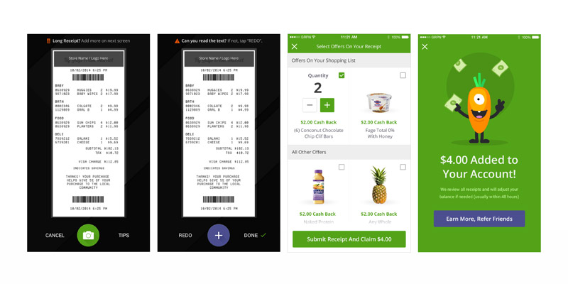
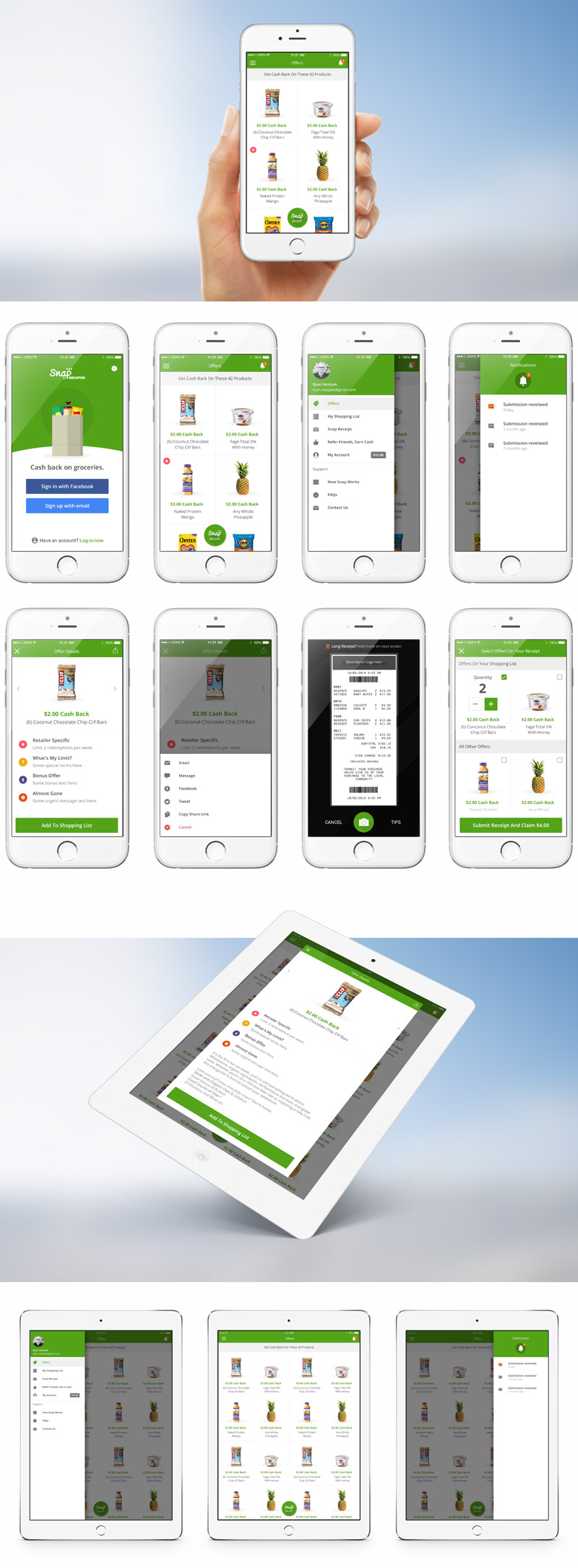
In addition to all of the screens above, a selection of the rest of the iOS app design appears below.
Material Design
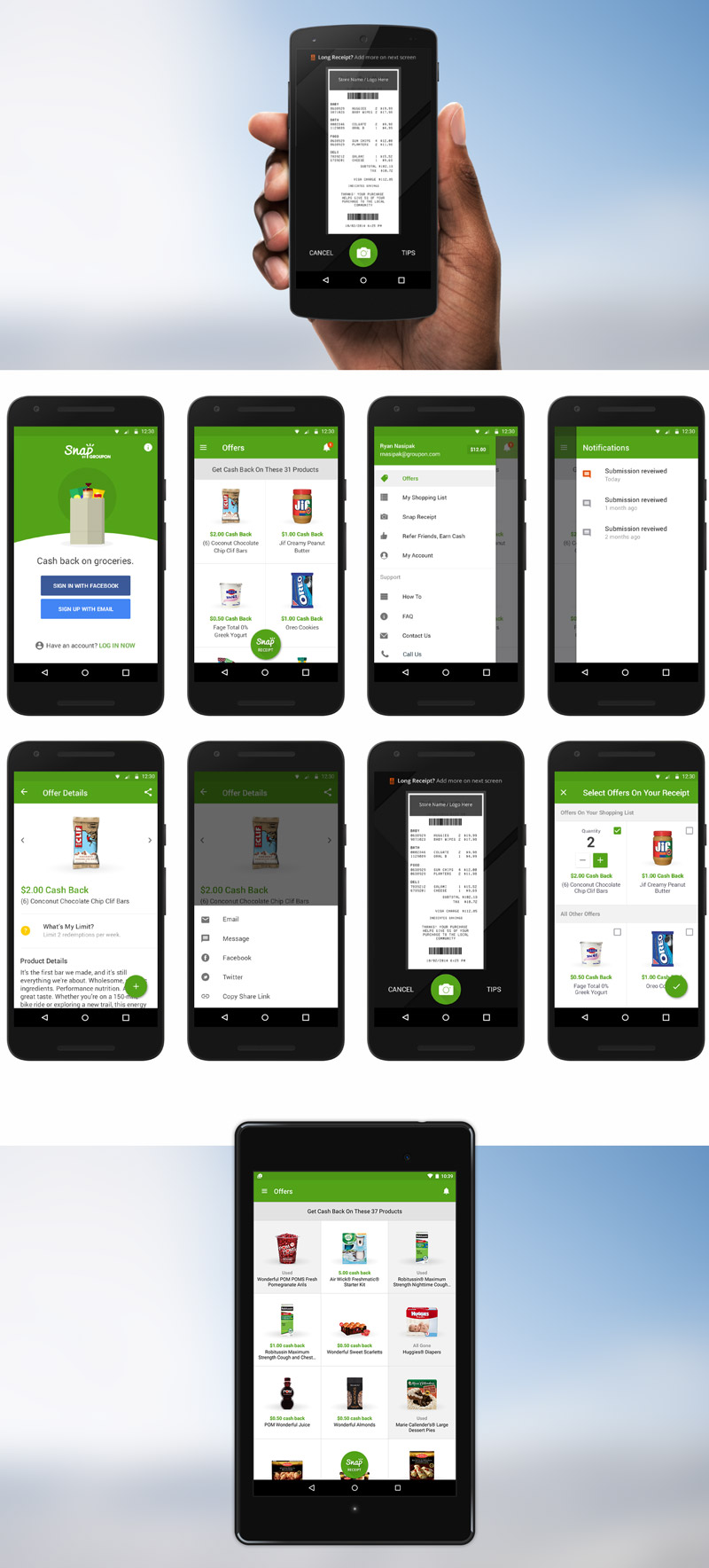
As part of the re-launch, the Android app was given a complete makeover. Using Google's recently released Material Design guidelines, I lead the product redesign effort in applying these best practices to a new, fresh experience on Android.
What started as an iOS app, that was shoehorned in to Android, is now a beautiful experience that takes advantage of all the most recent Google design and development practices.
Desktop
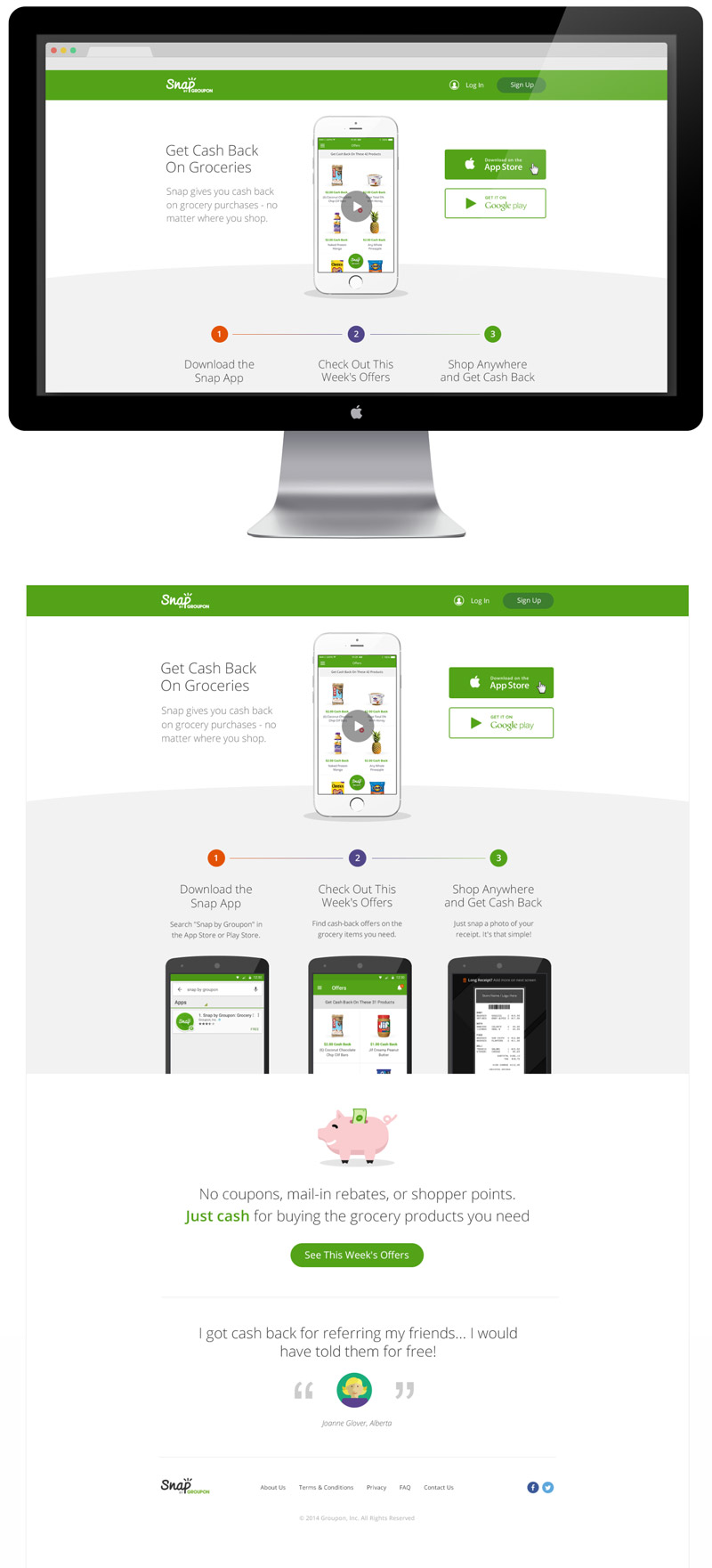
The rebrand and redesign also extended to the web, to unify the experience across all devices.
